iPhone 14 Pro Thoughts: It's About Damn Time
The first iPhone that has the right to be called "Pro."
I upgraded from an iPhone X to the iPhone 12 Pro Max in November 2020, which was a massive upgrade. The larger display, the giant performance leap, and the huge camera jump were all worth the while.
It didn't feel right with the iPhone 13 Pro, as tempting as it was to jump to ProMotion Island (too soon?). I survived hardcore FOMO and stopped myself from upgrading in hopes Apple was cooking up something big for 2022.
Little did I know, they were cooking an entire meal.
The iPhone 14 Pro Max, without a doubt, is the most excited I’ve been for an iPhone since the iPhone 5S. It’s not perhaps so much about what the iPhone 14 Pro has to offer that drives my excitement, but instead about its potential and what it means for the future of Apple devices.
This is not a full review covering every aspect of the iPhone 14 Pro (coming here and to YouTube, hopefully, in the coming weeks). Instead, this will mainly cover Dynamic Island, thoughts on the display, and a few other tidbits.
Dynamic Island
Dynamic Island: clever feature, peculiar name. I’m usually a fan of Apple’s crack marketing team, but they missed the high point on this one. Not to say I have any suggestions for what it should1 have been called, but Dynamic Island is an odd choice.
Dynamic Island is emblematic of Apple’s obsession with integrating hardware and software. It blurs the line between where the actual hardware of the iPhone 14 Pro begins and where the rest is the software. It’s the best hardware and software integration I’ve ever seen from Apple or anyone else.
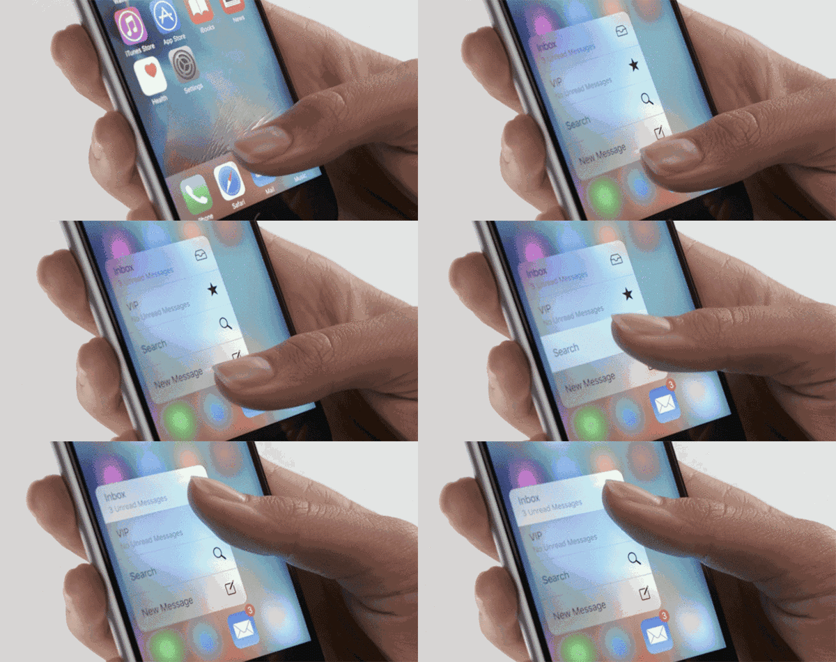
Dynamic Island reminds me of 3D Touch from the iPhone 6S. An iOS experience or visual interface redesign rarely correlates with a specific iPhone model. Think about it: iOS 16, whether you’re on an iPhone XS Max or an iPhone 12 Pro Max, is the same thing.2 There is nothing different about the iOS experience.
3D Touch was the first time this changed. iPhone 6S customers had an entirely new way to interact with iOS and its apps. It introduced a new dimension to the iOS experience that was available only to Apple’s latest iPhone.
Dynamic Island is once again a time where Apple is separating not only the latest iPhones with hardware features but software, too. Like many, I've always advocated that Apple take better software advantage of its Pro iPhones with their larger displays instead of just scaling up the same iOS that runs on smaller iPhones.3
While there is more Apple could do to utilize the larger iPhone displays, Dynamic Island is a solid first step into a new era for the iPhone, and I’m all here for it.
As someone who lives, breathes, and makes a living reporting what Apple is working on, the biggest surprise of Dynamic Island was not what it provides to the user experience but rather its existence itself.
There was 0 chatter about Dynamic Island in the run-up to the event. None. Zip. It’s uncommon, but not rare, for Apple’s secrets to actually stay secrets. And oh boy, Dynamic Island was a secret.
It would not surprise me if you could count on two hands the number of people at Apple Park that knew and worked on Dynamic Island. It was probably a small team, within another team, inside another team, within a larger team.
Hardware engineers who worked on shrinking the TrueDepth system and front-facing camera into the pill-shape and hole-punch cutouts probably had no idea about Dynamic Island. Engineers working on iOS 16 itself probably had little idea, too.
In its current form, Dynamic Island is great and shows extraordinary potential - perhaps more potential than any other new iPhone feature that has come before it.
But the limited resources and siloed nature of Dynamic Island’s development, I believe, limited how much Apple could do with it. Now, the curtain is off, and a new Apple-wide effort utilizing every software engineer under its roof can genuinely begin to shore up Dynamic Island to its fullest potential.
There are several ways Apple utilizes Dynamic Island on the iPhone 14 Pro with Now Playing, background activities, and more. Using my iPhone 14 Pro Max, though, I do feel there is more Apple could do with it. Take Siri, for example. I think it would look great in Dynamic Island.
I don’t think it’s fair to judge Dynamic Island just yet, as I suspect it’ll gain more use cases within the coming months (especially with Live Activities in iOS 16.1). I can say that I love it and can’t wait to see what Apple does with it next.
The Display
My biggest issue with my iPhone 12 Pro Max was brightness. Every time it got hot, it would throttle down the brightness to a degree that was not legible in sunlight. The iPhone 14 Pro, which Apple says reaches 2000nits outdoors, gets impressively bright and is really a beautiful display.
And oh, ProMotion is excellent, and I’ll never be able to return to anything else.
The Always-On, Not Always On Display
The always-on display gets some getting used to. I got my unit early this weekend, and the number of times I've pressed the Power button to put my phone to sleep, thinking it was still awake when it was just in "always-on display" mode, is undoubtedly reaching the hundreds.
Having used it, it's clear why Apple waited this long to bring always-on to the iPhone. It is comical and somewhat odd that we're celebrating a "new" feature on the iPhone that has been in Android flagships and low-end options for the last 5 to 6 years.
But it circles back to this idea that Apple doesn't always have to be the first to do something, but they'll end up being the best. I'm not calling the iPhone 14 Pro's always-on display the best in the market just yet, but I am saying it's an overall smart implementation that I'm glad we finally have.
The attention to detail is superb: if you have an Apple Watch paired with your iPhone 14 Pro and wear it while leaving the room, with your iPhone left behind, it’ll shut off the always-on display. I was skeptical of the accuracy, but I can tell you it’s impressive. Always-on mode turns right back on almost instantly after I walk in.
The Cameras Are Something Else
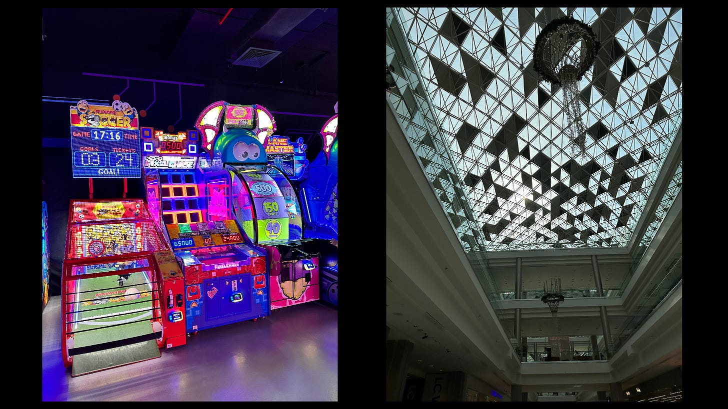
When I say the iPhone 14 Pro cameras are badass, I mean they’re badass. Like next-level badass. I am in no way a camera expert, but the images I got were stunning. I’ll have a full breakdown of the cameras in my full review, but above are two shots I took in ProRAW using the new 48MP sensor.
A True Pro iPhone
The iPhone 14 Pro and iPhone 14 Pro Max feel like the first genuine Pro iPhones. In every regard, from the display to the cameras, performance, and battery, it feels like Apple just threw everything it has into a single product. As iPhone 14 Pro entered development, I imagine these types of convos taking place between different company divisions and Apple’s executive team:
Yo, camera team - put the best, most badass cameras you can into this iPhone
Yo, display team - put the brightest, most advanced display you can into this iPhone
Yo, chip team - do what you do every year and put it into this iPhone
Yo, speaker team - put the loudest speakers you can into this iPhone (they’re loud!)
Yo, accessories team - sit on your asses and don’t give us USB-C for this iPhone
Half-joking, but I do mean it. The iPhone 14 Pro and iPhone 14 Pro Max are the most refined and Pro iPhones yet (no surprise). Not because they’re just the “latest,” but because as an entire user experience package, it highlights the best of Apple and showcases every discipline within the company - from silicon to software and more.
Apple is Apple’s best when it brings together its talents from hardware, software, and services in a cohesive way - the iPhone 14 Pro is Apple’s best in a very long time. It’s early, but I expect it will quickly become my favorite Apple product ever.


It seems like you're asking for a review or comment on the best iPhone models, but I didn't fully understand your request. Could you clarify a bit? Are you asking for a recommendation, a comparison of specific models, or a deeper explanation of a particular feature? I'm happy to help with more detailed insights based on what you're looking for!
Looks like you had fun a Chuck E Cheese taking dark pictures 🤩