“What does Apple have planned for space? Space is an increasingly important market/field. It won't make its own rockets, but surely, it has some plans, no?” is what I tweeted out in July 2021, and over a year later, we have an answer:
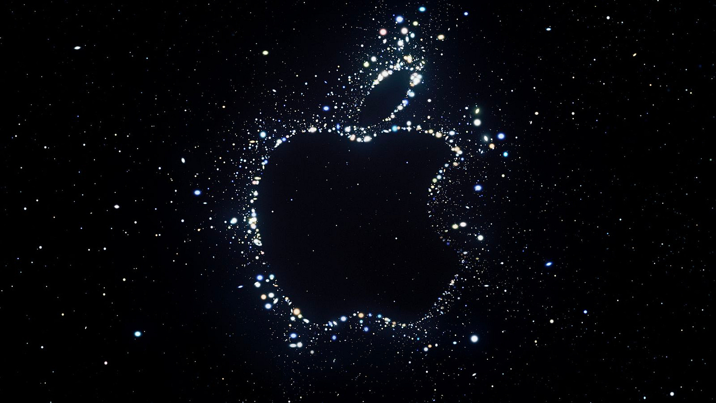
Apple's September 7 "Far Out" artwork is heavily skewed toward space, whether it be the stars, the "Far Out" tagline, or even the "Go for launch" wording Apple is using on Twitter.
The GOAT Mark Gurman thinks the “Far Out” tagline refers to how early Apple sent out invites for the event. The digital event invites usually come out a week before. It’s a smart play on Apple’s part: far out from the actual event and far out into space.
I think it's critically important to realize one thing here: Apple is not stupid. People love to read the company's invites for hints, and Apple knows it.
Apple is fully aware (more than you'd think) of the hype it creates with these types of event artworks and taglines. It's also fully aware of the rumors and the speculation. Knowing this and how people read into the littlest of things, they're going to trick us and play with our feelings like a bad ex.
Post-event, it's much easier to look at the event invite and determine what Apple was trying to tell us, and more times than not, it's not much. Let's look at a few examples:
Apple logo with neon lights.
Pink/blue sky, new bronze color?
Astrophotography?
In the middle of nowhere, so we’re getting satellite connectivity?!
Nope. None of it. Other than a possible hint at the new Sierra Blue color, Apple's "California Streaming" invite for the September 14, 2021 event meant nothing other than the backdrop for a few event videos.
On the other hand, the “California Streaming” tagline was a cool segway into what I think was one of the coolest intros to an Apple event ever and a nod to how presenters would be presenting from outside Apple Park and from locations across the state.
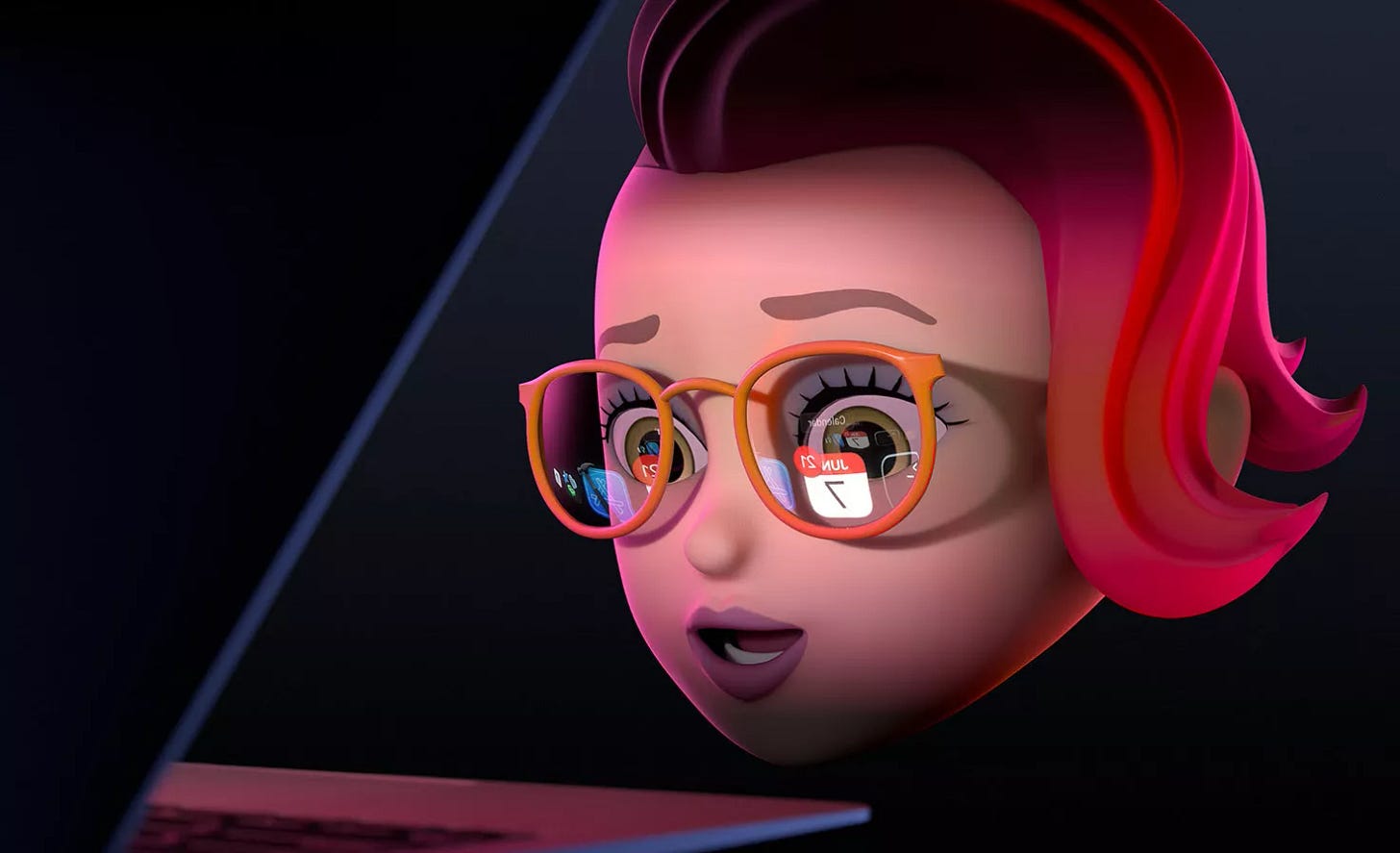
My absolute favorite example is WWDC. Since WWDC 2020, Apple has used the same Memoji-styled character heads for its invites. At first, it was cool, but I'm getting sick of it.
The above image from WWDC 2021 sparked some worthwhile speculation, with people thinking it was hinting toward the long-rumored launch of Apple’s AR glasses. It wasn't and was just a fun reference to Craig's iconic "let's set the mood" scene in November 2020 to show off instant wake for Apple silicon Macs.
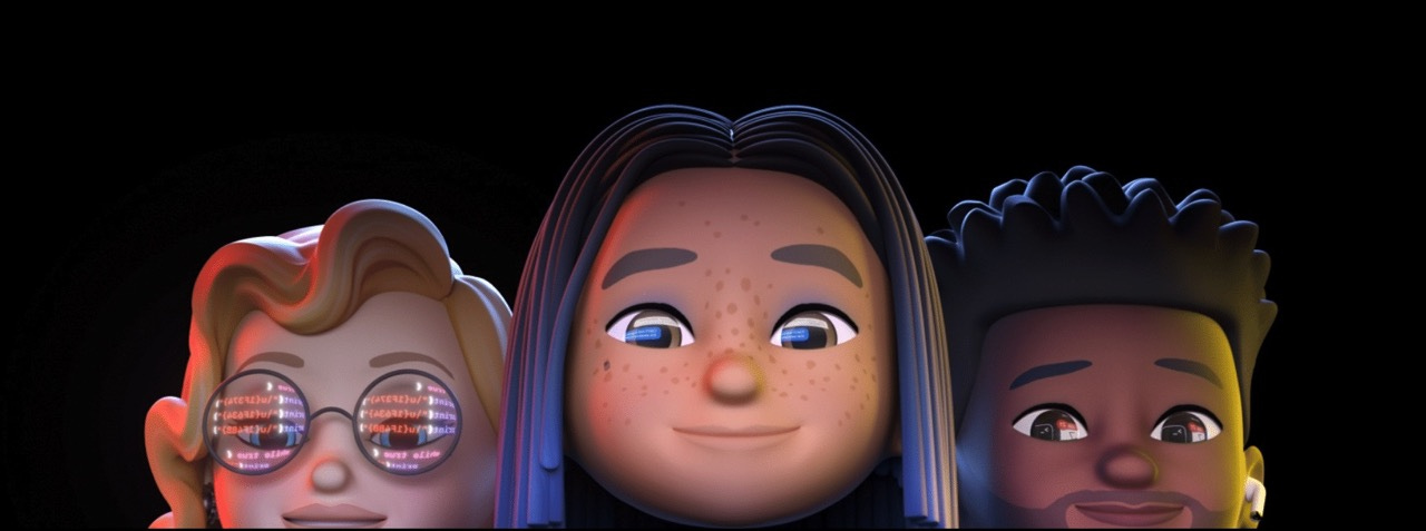
Take this, for example. If you zoom in on the glasses on the right, the code in the reflection translates to the following:
u{1F374} is 🍴
u{1F634} is 😴
u{1F4BB} is 💻
Everyone thought (me included) that the inclusion of a laptop followed by "while true" was a tell-all indication we'd get new Macs at the time (this was when we thought we'd get the 14-inch and 16-inch MacBook Pros). Unsurprisingly, it was just a nod from Apple to the sleepless nights eating ramen noodles that developers have in front of their Macs with Xcode.
Look, I'm not trying to say these invites mean absolutely nothing. They have meaning, but it's not, most of the time, anything product-related. Especially with these digital events, the invites will dictate the wallpapers for the new products (in this case, expect stars with the iPhone 14 wallpaper), the event transitions, and the intro to the event.
Saying that the inclusion of stars means astrophotography or satellite connectivity (which I believe we're getting in under two weeks) is just a waste of time - but it's fun, so we'll keep doing it.
In all honesty, the space theme probably means one thing: iPhone 14 prices will be out of this world.


